Jun 26, 2015

HOW TO DESIGN STUFF, PART I - SWTCH NIGHTLIFE

Yes, another design process post it is. Sometimes I feel like posting just a quick description of the end result, and sometimes I want do upload the steps & talk about the whole design process with all choices, different styles and so on, it depends on my mood. Today I want to take you guys on a journey, I hope you guys enjoy reading this, and maybe even learn from it.

Oh, and this stuff has been released on their Facebook page. Check it out and don't forget to like for further updates on techno, dubstep & dnb parties near Rotterdam. The opening is on the 17th of October 2015, at the Keileweg 8. 
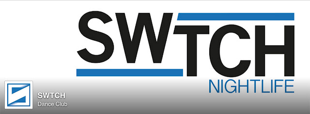

End result, in a Facebook environment.


SWTCH - The briefing
The guy that gave me the opportunity to design for this SWTCH project is Jorrit, known for his DJ career under alias The High Class, but also for organizing parties such as Reggae *420* in the (still abandoned) Tropicana building in Rotterdam, and Bombaclad I/II in Pakhuis Meesteren, also based in Rotterdam. I saw him spin some dubstep and drum and bass before on a party somewhere, but I really got to know him when I had the opportunity to work on a project together.

So enough about the people, let's get started! As in every project, you start with the briefing. The part where you get to design a rough idea in your head, but have to listen closely to your client at the same time. Jorrit explained me about the idea: 'Me and a couple of friends are making a plan for a new club concept, 'SWTCH' (pronounced as 'switch'). We are mainly going to host electronic music parties, and we have a real love for the techno logo design. The colour we want to use as an accent color is blue.' Read it for yourself, these guys couldn't be more precise while telling their story. Awesome.

Text design ideas come first
Most of the time, I instantly get a design to pop up while hearing these business stories, but experience learned me that the first design isn't the best design. That's why I always feel uncomfortable while presenting a single design, so my tip to all of you is: Always present a minimum of 2 total different designs! These two should have at least 3 variations. This way you can really surprise your client, when you explain the choices you've made.

The first idea that came to mind while getting almost every briefing, is the text based one; as you guys see below. First off, getting a nice font with this idea is a must. I chose a sans serif font because it is a modern typefile, but remains stylish. I decided to 'switch up' these letters in a playful way.

First text designs
Between all other design work, keep twitching text and font stuff to decrease the density and increase unity, so it all fits together. Time learned me that my designs were too compact sometimes (especially when I get too hyped over a project, and with SWTCH it was likely to happen, haha)

The other design work you said? Yes, I always search for a symbol that fits my project. And as every club has a photo page with pictures from the previous events, I really felt there was need for a symbol, to put on pictures, coasters, flyers and so on.

Give the company a face
When making an symbol for whatever company you can imagine, I work on a trust basis. I have trust in a compact and simple, but efficient design. Within most logo work there is one rule that always remains true; 'Less is More', that is why I always fall back on the basic forms. Squares and circles got to be a designers best friends.

For the first round in the SWTCH project, I chose the circles to work with. 2 Circles could make an S, I discovered that while making one of the last graffiti blackbook sketches. I take out a quarter of both circles, and add them in a extra circle at first, just to check how it looks.


After that I played with some computer chip - like holes in the middle, and tossing and turning the pieces around at different angles. The different choices are born!


Part two on the symbol design
As I told you in the begin of the design process.. The first design isn't the best. After all I am really happy that Jorrit and the guys asked me to do something totally different, though it came a little bit as a disappointment at the moment. Try to stay friendly in this stage, it is business nonetheless! You just need the time to realize that this is an second opportunity, to do even better. That is a better view to continue the design process!

Most of the given pieces are the same in the second approach; We're aiming for a simple design, with the colour blue for attention, and because Rotterdam is a well-known city for its harbor. But this time I wanted to use an (techno) square for the basic forms. To 'SWTCH' things up again, I added a diagonal cut in the middle. At first I wanted to make a button (which could also be a switch), but after a quick coffee break which are really necessary sometimes, I realised that it looked like an S!

Oh graphics, you can let me feel wonderful haha. 


The last step with implementing the gradients, felt really good to pull off. Usually I think gradients decrease the power of a logo, but in some projects it fits in perfectly. After making this, the tweaking and twitching is still in full process. I choose to let go of the 'text switch' I did at the start, unless the logo is used without the symbol. It is all about unity.

That's it for this time. Give this a +1 on Google+ if you liked this type of posts, I might do more of these in the near future. And remember, 'Less is more' is the rule for logo work!

Keep on creating,
Seck Design

Jun 17, 2015

ILLUSTRATION - STEP BY STEP - ROSE PRACTICE!

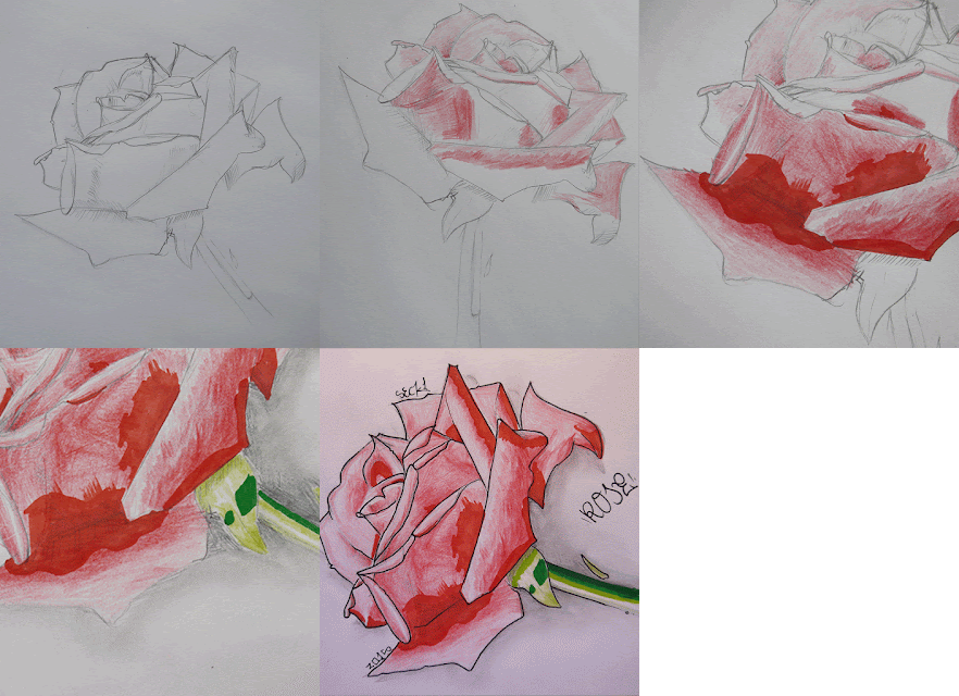
Today I felt like practicing my shadows again. Drawing roses was the thing to do. I has been a long time, so there was a real need for that. I've made photos throughout the process, just as a note to myself; Nothing wrong with documenting some of my practice work as inspiration later on. Practice is to make things better, so I hope I'll be able to pull off more detailed shading in the future. That is what this practice is all about, but I have a real love for the tattoo style of drawing plants and flowers - because of the harsh/opaque outline work just like in graffiti.


This step by step post isn't how I did them back in the day. Inspired by another artistic blog, I'm trying to explain all my choices I've made below every photo. I've used a photo reference for detailing, but my drawing style is still to cartoonish for this type of drawing. I'm unable to reproduce it as realistic as I want, but yeah, 'practice makes perfect'.


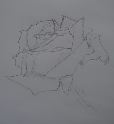
As in almost every drawing, I start off with a sketch. I didn't want to upload the reference photo because the end result really doesn't look like the real deal, but there is only one advantage of sketching; It's the perfect way to get the basic lines of your idea on the paper. Just to be clear about the lines, I did put these in the spots where the shadow was the darkest of all.


At this point, I had to watch more closely for the basic shadowing; This part was done with pencils, and for the real deep tints I've used a red marker later on. To add quick shadows is important for me to sort of 'unlock the 3d features' in my project.


A more close up look at the coloring details. If you look closely you will notice that I tried to get a nice shade done with the marker, but because I only wanted to use 1 marker tint, after filling one leaf I realized this wasn't going to work how I wanted, so to keep it clean I decided to color the surfaces plain, the oldschool way. We'll do better next time, Seckie.


While coloring the cane I saw which direction this was going to.. Rather shiny, than realistic. But that doesn't matter, because thats the way I use to work. I can't blame myself for trying something different and just fall back in old fashioned ways of drawing, without any practice. Second thing is, I started drawing when it came to my head just a couple of hours ago, so I'm sorta content with what's happening on the paper now; Without any preparation this is all-right.


To finish this experiment, I wanted to see what opaque outlining does to such a soft and lovely object like a rose. I ran a fineliner over almost every line, and gave a quick pencil fade to get rid of the white in the background. When executing the right shadow we could achieve extra 3d, but that wasn't the main subject here. After a little white highlight we were done.

What I think, is that it is important to be able to reproduce the right shadows in the projects that need that little extra-dynamic feel. Though my work is opaque and filled with lines, proper shading could make things better - for real. Today, we gained one step to the destination; Proper Shading.

See you guys next time.

Seck1


Jun 14, 2015

SUNDAY IS BLACKBOOK DAY #12: THE COLOR MIRROR!

After the post from last week, when Tober mentioned my style has sorta 'plateaued', I'm really desperate to re-discover the letterforms and colorbooks of graffiti. I'm going to deal with all those little pieces of information a different way, so I could make myself able to make my style more 1 of a kind. The journey moves on..

Today I started with a quick pair of see-through lines on top of my S. Even though this is an concept from last week, I really have a good feeling about this effect, and I am expanding this knowledge on the wall soon, for sure. The other effect is more from the a5 blackbook I have from 2012, not that special and 2 colors max.. But executed with more 3d, shadows and highlights.

But that isn't where the 'totally new' approach kicks in.. I decided to use 2 outline colors, and flip all effects once I hit the next letter. That is why this blackbook piece is called 'The Color Mirror'.

Enjoy this weeks edition folks!

Seck1


QUICK PICTURE BY ST.

Jun 7, 2015

HOF DAY @ EINDHOVEN - STEP IN THE ARENA 2015!

What a perfect timing for this event. Just in between all rainy days this beautiful weekend flourished into the dopest festival of 2015, till now. Step in the Arena, you did a good job. I'm definitely coming back next year, saw so many dope writers today.. Yesterday Sofles painted the inner circle, a pity we've missed him. Big up Chas LoveLetters btw!

Beside all the kings, we found a fun spot beside the so called 'lineup walls', and we've dropped a quick one there. Just for fun, together with Tober and Fines. Made the hole in my 'e' an eye, to create a monster like creature.. I was happy that I did afterwards, because I couldn't get no clean lines out of my black 94 can.. Reminder: Spraycans have to be used once in a while, otherwise they'll clog for no reason, meh. No latex this time, just a freestyle with cans!

Enjoy!

Seck1

CLOSE UP ON THE EYE! - MONSTER E

HQ will be added SOON!