Copyright © Seck Design - Blog
Design by Dzignine
Dec 26, 2013

ILLUSTRATION - 'BEWARE OF THE OCTOPUS'

I think this is the last one for 2013.. Thank you for all the views, feedback, commentary and promoting. It was a big year for me and I couldn't do this better without all your support! I hope you all will face a beautiful 2014, keep working hard!

Yesterday I started with an monster octopus; I want to dive in tattoo sketching really bad so thats a good one for 2014! It came out more pink as I wanted but I focussed on the lettering, the big guy eating a ship was an side issue. Overall it came out well! Might digitalize this one 1 day, illustrator works for a shirt or something! 

This is an good ol' 3-steps-exposed type of blog; one sketch-pic, one colouring-pic and the end result as another photograph (outlines and finetuning).

Enjoy, have a nice holiday!

SECK1


'BEWARE OF THE OCTOPUS'

Coloring, pinkish!

Sketching part

Dec 22, 2013

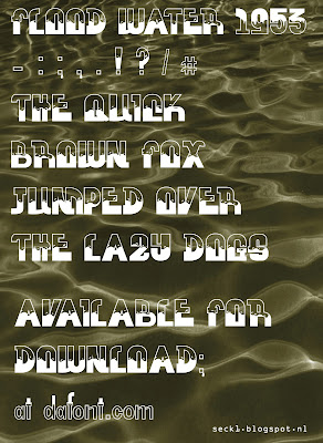
FREE FONT DOWNLOAD: FLOOD WATER 1953!

So I got diagnosed with the typeface disease this month.. And it isn't that horrible! A new font was made.. Small letters, capitals, 0-9, a couple of other characters so you can write not only titles but a whole story, and we got a new font! Also learned more about kerning and I tried to get al the mi stake  s out as you know what I mean haha. Enjoy!

FLOOD WATER 1953 is a font inspired by, well.. floods. I tried to create capitals that are being filled with water. The bigger your corps is the more details you will see, I worked many hours on this one..

Also the game Bioshock played his role in my sketching and brainstorming process. That oldschool 'Rapture' font is so beautiful!

And 1953? The year 1953? As most of you know, I live in Holland, Europe. The small country with the sea beside it. Because of that big, enormous, strong sea, we need even bigger, more enormous, stronger walls to keep the water outside. In the fifties that walls broke, and many villages were washed away with their people, houses and furniture. I saw a movie about that event too. Interesting enough to put some extra figures at the end!

DOWNLOAD LINK:
https://www.mediafire.com/?odjjaght58kzhw7

Soon available from Dafont.com!

http://www.dafont.com/flood-water.font


Seck Design


Dec 12, 2013

NEW KING STICKERS - TIME TO TRADE!

So today my 'xmas present' came. My new stickers for promoting my blog! I ordered them at Flyeralarm! Bigups to my homie TOBER for showing me this site.. Easy to order, very cheap, quick delivery, but descent quality. Nice.

Nah, no new design at all, I also made a shirt with this on my seck1.spreadshirt.nl account, but I am proud of that one so I thought it would be smart to keep in mind that I and many others love it. Check out the contact page for my email adress, or hit me up by phone, facebook or whatever because I'm in for trading! Let's get the blog famous! 

Greetings,
SECK1


EDIT: My brother, carlover and photographer, put my sticker on a model Lamborghini Murcierlago 1:18.. Nice! The logo 'ST Photography' is made by me. Awesome seeing him put his time in photographing my work! Thanks Stan.


CAR SIGNING AND PHOTO BY ST PHOTOGRAPHY


Dec 3, 2013

DRAWING PORTRAITS - KIMBERLEY

I always wanted to draw proper faces, in my earlier days I practised many hours but it wasn't getting better in my opinion.. Now I started drawing faces again, and with a bit of internet help I tried to get people to recognize who the girl is I drew. And it worked! 

I searched for a gift for Kim, but I wanted it to be special, something you wouldn't get for Christmas normally.. I thought a drawing was a good way to show her how much she means to me, but I didn't ask because sometimes finding such an artwork in your closet years later can hurt haha. I was so happy when she asked if I could draw her.. *lovely moaning* Anyways, also a good opportunity to practice! Started off with printing the pic, and (lightly!) sketching the basic lines with a HB pencil on a3 paper with the pic next to it. No tracing! Then getting to the shadows with B pencils and the highlights were done with a white Molotow 227HS paintmarker. Nice finishing touch isn't it?

SECK1

<3.

Nov 20, 2013

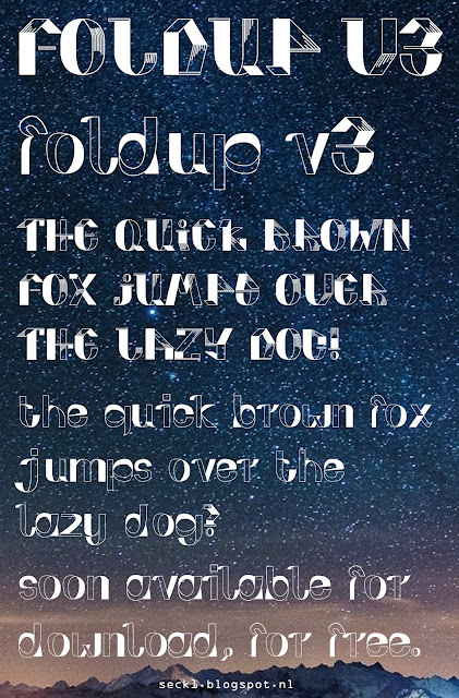
FREE FONT DOWNLOAD: FOLDUP V3

Aye aye! Started as a school project for designing letters, I had to make a capital A-Z, and all numbers 0-9.. We had to testprint all of them in different words and phrases to check if its readable enough. I was addicted instantly, designed my font and.. I made it work! Didn't expect it was so easy, because back in the day I've tried this with an other font editor (Something like FontLab) and it didn't go well at all. Glyphs is quick and easy enough to understand the interface in a couple of hours, and export a font that is actually usable from your .ai illustrator file. Check it out, a Mac app is available from the App store (budget app) but this was made with the trial version from the website, which is usable for 30 days. Thats nice!

EDIT: Glyphs 2.0 is out now! Got to try some new font designs soon :)


http://www.glyphsapp.com

I proudly present you guys my FOLDUP V3 font!
I received a couple of nice and kind reactions already, and as it is near the end of the year and christmas & the new-years celebrations are coming up, I want to give it away as a present!

I tested it with Word, and the basic text editor from windows, but also with Photoshop & Illustrator CS6 on a Mac (I think it'll work on a windows machine too). It contains capital letters, small letters, 0-9, couple of math symbols, euro/dollar sign, and many more!

This font was made for headers, not for writing whole books. Expect a creative letterstyle! Enjoy!

DOWNLOAD HERE!
http://www.mediafire.com/?qrs2ef8d75729kk

http://www.dafont.com/foldup.font

SECK1


Nov 6, 2013

SKETCHBOOK UPDATE - GO NEON!

About to hit the 5000 views, much love to the many followers from all over the world! I appreciate the support so much, and I start to get positive feedback from many other artists and writers. Your love keeps the creative mind-sparks coming, keep spreading the love! I will always work on the negative comments as well so just drop me a message! A couple of guys already did, thanks!

5000 views is a statement for me, so you guys deserve a treat! I will open up my Premiere and After Effects again soon for a BLACKBOOK 2013 video! Subscribe to my youtube channel, so you won't miss anything. It is going to be a masterpiece! Stay tuned!

Today I opened up my blackbook again for a simple one. I was feeling like doin' a neon piece - I did many colour tests and pre sketches earlier already - and I liked the end result.. There is more explosive piecing work in my book, but all wil be featured in the video; Also some never seen before work! There is also a pencil sketch included. Enjoy!

SECK1


'GO NEON'

GOTTA LOVE QUICK WORK..

Oct 26, 2013

BUSINESS CARD DESIGN - ROPANA RAILSAFETY!

Haha, you remember the Ropana piece sketches? I did announce a businesscard design & restyle in that blogpost aswell, Paul asked me to do it.. And as it is a company that has to keep the safety near the metrorails when there is maintenance work to do, you never know when they're working; I got a couple of months for finetuning before I could speak properly to my client and then.. My order was placed at DrukwerkDeal haha. My design was 1000 times thought but without the help of DrukwerkDeal it wouldn't have came out too well! I really liked the way of ordering (when uploading a file they test it for you on crop marks, cmyk colours, overset text and more!) and my 200 business cards were here in 2 days!

So back to the subject: I got a old business card from him with the message he 'wanted something new'. I am getting more and more familiar with printing methods and things that are essential when designing, so when I got the card it was a bit of a laugh.

So the restyle was more dark, because they often work in the night and the tunnels is what the subway is famous for. Also made an illustration of a typical 'Walki Talki'; They use them to contact the subway company when there are problems, or they want to ask a question about the status of the railway tunnel they're working on. Nice and full of info.

The back was more empty, the greenish tints are used again but in a negative way.. Also the key info elements are added at the bottom. A nice new touch for Ropana!

SECK1

Thanks to GraphicBurger for providing this mockup!

Oct 20, 2013

BROUWERIJ 'ANSELMUS' - THE BEERLABEL DESIGN

Hi followers! If you guys read my blog from the start on, you maybe notice I've made a (home)printable beerlabel for my uncle's homebrew beer. The label was for the 'Honing Tripel', a nice 10 percent alcohol beer with an soft honey flavor. The end result really asked for an return.. So here we go! Its a beautiful opportunity to practice producing a printable and paste-able label.

We already created the 'Honing Tripel' design (in the middle). There's a nice beer structure on the back and the display of a bee doing his work. The left one is a snow covered mountain in the evening.. I wanted to give it a warmer feeling because its a christmas special called 'Kerst Bier'. The vector shows some snowflakes falling down. And last but not least; the right side. This one depends on the season, but I thought autumn colours would fit on this 'Seizoens Bok'. Again a mountain (in daylight this time), with in the display 2 falling leaves.

We already talked about a fourth piece to complete the puzzle; A cherry flavored beer. This is getting more and more creative! We didn't catch a name for it yet, first we want a name for the brewery itself. The logo is that little A on the left of the labels, because my uncle owned a pharmacy when he was younger. That got him into beer brewing. More in a short amount of time!

SECK1

TESTPRINTING AND FINE TUNING..


KERST - HONING - SEIZOENS


Oct 4, 2013

STICKERS - SECK HEAD - HIT ME UP!!

Long time no see guys! New works are on their way. I chose a plotted design to be noticed in the streets or anywhere else. It is in full colour and after the print they coated it with UV protection foil, to protect it from the violence that mother nature produces from time to time. Got it done in three colours.. Without noticing I could drop some 'Seck Head' traffic lights now haha. Dope!

SECK1


Trafficlight placement!


Sep 12, 2013

GRAFFITI - 'ALIENS JUST RECYCLE'

Ha, last day free of work.. School started on tuesday. When I was in bed the night before I looked upon my wall.. It had so many different colours painted on that it was really, really a mess.  So I decided to repaint the whole wall with some Sigma Superlatex I got from Paul but halfway through the process i couldn't resist to be creative. So I taped it all  Enjoy this 'Aliens Just Recycle' piece. Its an Half Life 2 like character blazing the paint on my wall. Dope!

SECK1


Sep 4, 2013

BLACKBOOK SKETCH WITH A QUOTE.

Yesh, back to my blackbook again. Last day with some free time, school is starting tomorrow.. Decided to keep it more like my old style but it came out doper than that.. 3 pics again, with the sketch, fill, and the end result. Thought about a quote to add, so I wrote it among the side of the piece.. It was the first time I did add a total quote to my piece instead of just a title, so it isn't that well that I wanted it to be but its allright. Enjoy, and remember;

'I am not an artist.. I just love steppin' outta comfort zone'.

Yo!
SECK1


ILLUSTRATION - OWL TATTOO DESIGN

Ha, another request for a tattoo design.. I hope she will get it done because I really like this one! I am proud of it, and I saw that the blog generate traffic due to this type of illustrations.

She asked for an owl with some music and nature influences.. It has to be very active, one that meets the eye in an instant; So many lines involved in this piece. Free to use, but drop me a message if you want to republish it.. Love.

SECK1


Sep 1, 2013

REPAINTED MY EASTPAK FROM 2012!

School is coming closer, wanted to paint my eastpak again for a long time already.. But I didn't have the time or cans. Today I did got some time and cans! From the 'HEMELS' piece there's some paint left, and 'ROPANA' is coming too.. Big plans yo!

First off I painted it gray with Henxs paint.. After the paint was dry enough I painted some black and yellow lines over that with MTN 94's. Let it dry for half an hour or so, and started sketching the outlines. In about an hour or 2 it was done. I've used a simple version of the 'Baby Colours' sketch in my blackbook, remember that one? Enjoy!

SECK1


Aug 20, 2013

STICKER TRIP TO SOUTH FRANCE - 2013

Aye! Long time no update, new shit is coming.. Me and the family had a great time in France, without internet so I couldn't upload new blog messages. I will upload a new blackbook sketch this afternoon, for now some edits of my stickers.. Spot dem in Monte Carlo and the surrounding districts! Click to see the bigger image. Enjoy!

SECK1


Aug 11, 2013

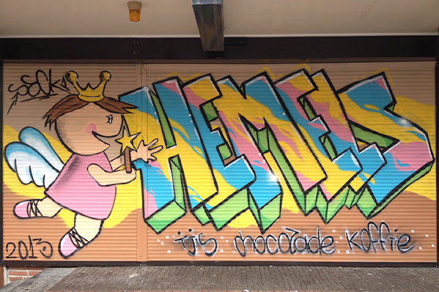
GRAFFITI - IJSSALON HEMELS BARENDRECHT


Finally we did the 'HEMELS' piece, it was done in a week or so. Because of the material we had to paint on (we had to paint an aluminum roller shutter), we had to take some extra steps. 


I want to thank the Hemels' crew for being so friendly. The mails and the conversations we had about this project were always pleasant and with a positive put in. This was a great opportunity to gain fame. I also loved the shop, and the ice cream is delicious! Offcourse its handmade with love.

DAY ONE
So the sketches are done, the supplies are in but.. We had to take some steps to get the paint to stick onto the surface. In the 'investigation' I did to get to know more about the aluminum and the paint I use, most people said it was very hard to paint aluminum. We did setup a plan, so in the first day we decided to clean up the surface, get rid of the old 'tags' that were on, and sand it a bit to get the paint to stick on.

Preparation part I.

DAY TWO
We started early again because we had to paint the base coat, and the shop opens up around 1 o'clock.. We sanded the pole in the middle again, because it was a silicone based paint. After dusting off the surface we tape it all up and get the primer up. This is starting to get more like it!


Preparation part II - 'Een goed begin, is het halve werk!'
DAY THREE
Allright, the day to make a good start on the 'HEMELS' graffiti! First off, paint the basic sketch, the rest of the fill was a piece of cake. Just when I wanted to start the outlining it was 11 o'clock already and the paint has to dry for about 2 hours.. So we decide to play it safe, packed everything up and decided to finish tomorrow. 

In the afternoon I made a list of 'imperfections'; Things I have to repaint to make whole fill covering. The fill was already done mostly, me likey!

The fill has been done.

We later decided to finish the outlines in the evening, so we wouldn't have to stay off work the next day. Cor had his focus on the finish, so I have learned a lot these days about sanding and cleaning.. Lucky as we were, it was a nice evening to paint. The outlines always make it pop, and with the highlights it became even more crisp. It was as expected but I am really proud of the outcome!


Picture shot right after the last outline.

DAY FOUR
The only thing left was the text about the ice cream, chocolate and coffee right? In the sketch I wrote it in English, but after all the environment checkups (I watched the people walk by, most of them were old ladies or old men that 'didn't like this type of art') we just keep it simple.. Dutch, as everyone in my town understands. One last step, a little change, and we were done!


Daylight picture shows the popping colours :)

I really want to thank ijssalon Hemels Barendrecht, it was a nice opportunity. Together with my dad, famous for his vmquest78 blog, we gained a lot of experience! I loved most of the reactions from the audience, I even heard someone say 'Oh that is Hemels, the ice cream parlour', and that was when I wasn't even finished.. Nice! Love to all followers, keep in touch!

Seckie :)


Jul 25, 2013

GRAFFITI BLACKBOOK - 'DRAGON' PIECE RESTYLE!

So I was checking out my blackbook from 2012, and the first 20-25 sketches were made in Limburg when I was there with a friend and his family. We had so much rain that I couldn't stop sketching anymore.. But with a load of markers with me it was not a big problem at all.

Today I decided to redraw that dragon from then, the dragon E. But now with the ink markers to get the shadows done more nicely.. It isn't what I want yet; but I got loads of time to practice my hands off.
I've taken a photo when my sketching was done, after coloring, and after the outlines. As you already saw my youtube channel you may have seen the 'Blackbook 2012' video already;

https://www.youtube.com/watch?v=X97dbpCw21I

Yo! SECK1


Jul 19, 2013

SPREADSHIRT 'PLAYING CARD' SHIRT CAME IN!

My own shirt came in today, and I was suprised.. They did a really good job at Spreadshirt. Ordered some stuff a while ago (remember the 'DOPE' design from 2012?) and it also came out well, I really like their do it yourself-concept.. 

The design was fresh.. Yes I did spend much time on finishing it the right way, but the printing job was really good. The press notes weren't really noticeable; and the colours are just the same as in my testprints on paper. Nice! I made a collage to show you the close up and the shirt itself. It was an XL so I could see how they handle picture stretching; I usually wear L sizes. 

Get yours ordered at:

SECK1

WHOLE SHIRT - CLOSE UP

Jul 10, 2013

'SPLATTER ZONES' - CUSTOM VANS ATWOODS!

I went to work yesterday and I was tired as f*ck when I came back.. Just when I wanted to jump into my bed my vans order came in from a week ago. All my need for a nap were blown away instantly. Taped the whole thing up and started painting till late in the night.. But I also had to work today so finished it off this afternoon.  Enjoy this fresh new custom Vans Atwoods, only a iris blur was added in photoshop to keep the colours like they are in real life. 

I also have another pair of Vans, I might want to customize those too.. but I want to sell them. So if you like some custom Vans Atwood LP's in size 9,5 US, contact me with ideas!

Yo! 

SECK1


Jul 8, 2013

BLUE AND PINK BLACKBOOK UPDATE.

I was in the sketching mood again.. been a long time without a sketchbook, but my lovely mom got me some from the shop last week. As I own a macbook pro with photoshop cs6 too (a couple of weeks ago I bought one, Retina display is damn sick!), I don't have much time for blackbooking anymore. But I did find some time, and it came out well I think. More time is more inspiration!

Tried to 'switch' the 3D, and with the lots of color effect exercises and tryouts I did on school it worked well with the colors. Enjoy!

Seck1


Jun 26, 2013

'BLENDING CONTRAST' SKETCH..

Nothing is more sexy than a fresh new markerblock.. So threw a new banger out for y'all! Its called 'Blending Contrast', because I tried to blend green and purple together with some effects that are very opaque.. 3 photos were taken through the project. Enjoy yo!

SECK1


Jun 24, 2013

STARTED A WEBSHOP, 1 DESIGN FOR SALE ALREADY!!

Yo, Spreadshirt.com was already in the corner of my eye for a long time; You can upload designs and with every purchase you get on your site the extra 'provision' you put on will be send to your bank account. For example, I upload a design for a shirt, and its €17 by itself, I can sell it for €50,-- and the rest is mine. I like that idea haha! The first design is all about the king of the spraycans, its a playing card designed by me and it costs about twenty bucks. Get that stuff!

MY SHOP:
http://seck1.spreadshirt.nl

SECK1

The preview may be a bit pixelated, but I'll buy one myself soon and show it here!

Jun 21, 2013

POSTER FOR 'POPPODIUM DE BEUK'!

Yo, got a lot of work to do last weeks, school is ending soon.. Did a lot for those projects but also managed to get this one out, its an a3 poster design for a party but you will only be allowed with a mask.. If you are interested and you live near Barendrecht, check it out soon, June 29th! Visit beukonline for more info! 

SECK1


Jun 9, 2013

CAMOUFLAGED!

Productive week on school.. Last chances for the ones that had some bad grades, to get it right. I did sketch, but not much.. Still a busy week. 'Hemels' piecing is comin' closer, stay tuned for that tho. School is demotivating us, but the sun shines, so we're all happy. Welcome summer!

This evening was just to chillout but I really wanted to sketch after ideas did pop up.. Yea, no paper around.. While looking around in my room my eye fell on the wall, it was a big mess.. I don't have any spraycans at the moment, so grabbed my Molotow acrylic paint markers and dropped an S for y'all. Just a simple one but worth sharing I think.

Yo!
SECK1


AFTER
BEFORE


May 30, 2013

DOEL BELGIUM - PHOTO EDITS.

Been to the lost village of Doel in Belgium today. It was a short, but fun trip, tried to get a piece done there but it didn't work out as I wanted. Here are some photo edits I´ve made from the trip through one of the run-down houses I got into, made in Photoshop CS6. Creepy shit even it was just in daylight.. Spotted some dope tags and pieces, also from guys I know. Nice!

SECK1


May 26, 2013

UPDATE: SKETCHES FOR 'IJSSALON HEMELS' COMBINED.

The last step in the process, I added the angel logo to the lettering. Also edited the colours in Photoshop CS6.. I will print it for the next meeting so we can discuss the last parts, and after that we are going to get it done there. Be prepared, photos will come later! Enjoy!

SECK1


May 19, 2013

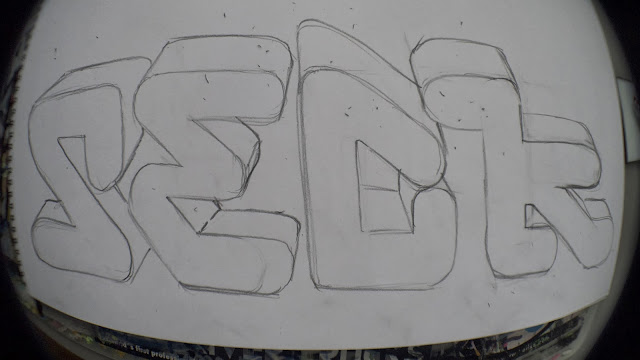
UPDATE: CHARACTERS FOR THE PIECE AT 'IJSSALON HEMELS'

Lettering is done.. I like the end result of those sketches, and I am very happy with the mail i've got from the shop itself.. After a little talk, we shared the same opinion; Add something in the design that is typical 'Hemels', so I sketched the angel like - Hemels logo in Seckie style. While both sketches are ready and everything is clear about the parts that have to be painted, I will combine both sketches in Photoshop to form it into one. The original logo can be found on the Hemels website.

More to come, enjoy!

Seck1


#1


#2

#3