Copyright © Seck Design - Blog
Design by Dzignine
Mar 27, 2014

GRAFFITI @ BERENKUIL, EINDHOVEN - WITH KERMIS, TOBER

Yeah! A spare day is always nice. This thursday was planned for only one thing, dropping some graffiti artworks at the Berenkuil in Eindhoven city. So we did! We met up at Rotterdam CS to get to Eindhoven 'what a surprise' by train. After spotting really nice pieces by 3MERS, HOTUS and DMG we entered the south side. Hehehe. There was only a lil' walk left to Berenkuil, but packed with 15 cans 'o paint per individual it was harder than I thought.. But we're still alive.

Really really dope spot, I saw some pieces from international artists like Sofles & Ewok (from the famous Ironlakfilms channel on youtube). It was hard to find more 'toy' writer in between those kings, but we found a couple. It still felt like it was a bad decision even after. Wow what a place. You guys should search for some photos on google or something.. Such beautiful work. We didn't really do a collabo, but it was more a day off with school friends / graffiti writers.  We all did our own thing, but nonetheless it was really pleasant. Tober went on to a different place but yeah.. He got friends everywhere. Damn. 

I started off with sketching my outlines and put up some green roller paint after.. I did a freestyle sketch with an golden E. The other letters are just like what I always do, blueish this time. The purple 3d and light-brown and yellow outline finished this thing. Proud of this one.

Enjoy this one,
Seck1


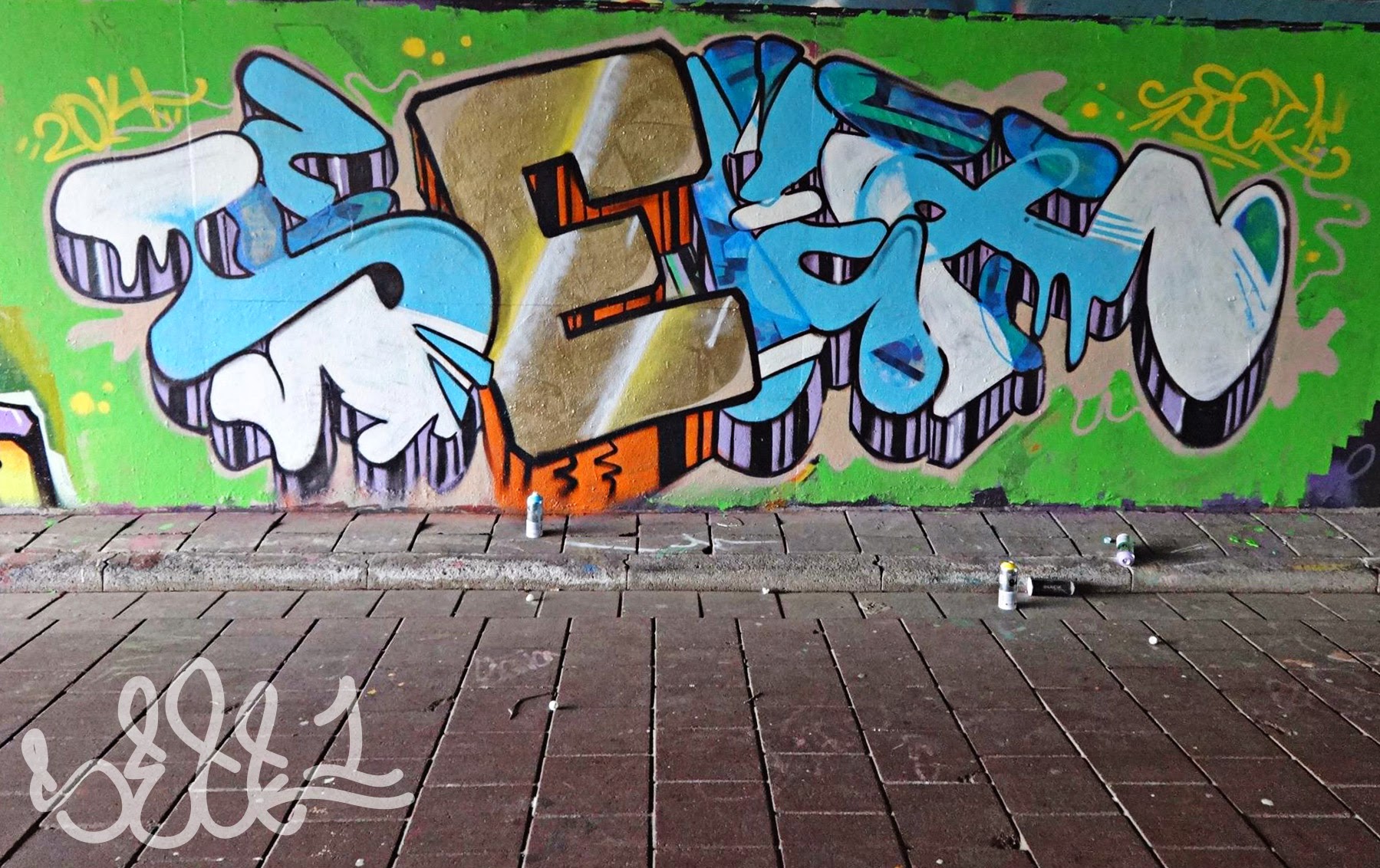
SECKONE  - GOLDEN 'E' - PHOTO CREDITS TO TOBER


Mar 23, 2014

TRYING OUT COPICS - 'NEVER CALL ME AGAIN'

Quick update here, learning to handle ink markers. I want to get better at this soon, so don't expect too much!

With all the beer labels and oldschool fifties music I became interested in Pop art and oldschool hairstyles more and more. Really nice to see how the people of my age tried to be different back then; the clothes for example are so different, but they have such a nice looking. Awesome.

I bought some Copic markers last week, I had a couple of other inkbased ones too (I think they're called ProMarkers or something), and they are extremely nice to add shadow effects on my letterstyling and graffiti work. One of the struggles I deal with everytime is.. Adding gradients. I discovered the blog of MarkerGuru today, while watching a youtube video about 'adding gradients with copics'. When I heard the word 'blogspot' my ears were on sharp. Soon as I visited I saw a blog full of nice tutorials and beautiful work. You really gotta check her out, she is even certified by Copic themselves. Well done!

I made a woman on the phone yesterday too, as you may have seen on my Instagram. On school they learned us that with faces, you got to make a couple of sketches before the best one comes out. Today was a good day to give it another try. And I did. This time she's biting her lip, haha. I've used more color, it still is a comic book type of drawing but I wanted to create more realistic shadows..  I'm pleased with this first try, there's a lot more room for improvement though.

See the picture below for the end result. 

SeckDesign


Mar 16, 2014

SUNDAY IS BLACKBOOK DAY #6: COLOR WHEELIN'

I got to be honest. After so many days, weeks, months of trying to step out of my comfort zone, the graffiti culture, I didn't really manage to do something else on a sunday haha. My good ol' blackbook is always staring at me when boredom strikes.. So today, a new and fresh episode!

I've met a girl on instagram. A lovely girl from Florida that loves music making and all other artforms. I'm talking to her for days already, and it is really fun because of the culture differences, foods and treats, explaining weird traditions, and so on. Really nice to get to know a girl that gots your back, even when you don't know her in person. Sweet.

I did the basic outlines with a pencil and was halfway the blue S, then I realised I used colors that are so opposite it would be hard to really get a nice piece done. Argh. (I've made a nice progress gif file to see whats up.) I messaged Chey for feedback and she asked if I knew about the color circle 'Van Itten'. I remembered I learned about that in college, but I never used it for my work before. Normally I would pick a couple of nice colours together, and start a piece; but greens, pinks, and yellows are always in my work. It started to get annoying that my whole blackbook was, in big lines, the same.

That is how the 'Color Wheelin' piece was created; With the color wheel offcourse. Started with the 3d shading, later highlighted with green and red stripes. The blue S & C, and the orange E & K were filled. Outlines are done.. A piece can develop quick, also with colors that I've never combined before. See for yourself below!

SeckDesign


ANIMATED GIF, CLICK FOR BIGGER PICTURE

End result - BEHIND THA COLOR WHEEL

Mar 11, 2014

BROUWERIJ 'ANSELMUS' - THE FOURTH LABEL 'KERSEN BIER'!

Yes! Here it is, the fourth label for the homebrew beer! I am getting more and more proud, this is all mine. I learned a lot thanks to Jan and this opportunity to make a series of beerlabels, the difference between the printing at home, and what you see on your screen; how to keep the style in all those labels consistent; photoshop things easier/more efficient, and so on.


After about 10 extra nights of restyling and finetuning, my uncle finally decided which name he wants to use in the future; 'Brouwerij Anselmus', or in my rough English 'Anselmus Brewery'. He chose Anselmus because that was a famous beerbrewer, and he created a lot of nice beer types. 'He started brewing in his basement when he was young, I did exactly the same' Jan explained. Excellent, new name, we also need a new (nah, new) logo. As I said before, Jan was a pharmacist before he started brewing beers. He now works somewhere else, but the pharmacy roots he has made him use the classic Pharmacy A's to specify his ale. Offcourse, I changed it a bit to make it stand out with other beerlabels and logo's. That's why the typical stripe on the left side was moved up to the top, for a hidden letter J. Excellent!
Anselmus logo


You may have read this before, label four is for the cherry flavoured beer; My uncle brews very widely. It is bit of an ale like beer, 10 percent alcohol, and it has to be drank with patience. Really nice to spend the evening with, and the 'Anselmus' beer label has to spread the image of the best taste and oldschool quality indeed. Thats why I chose for the red tints, to give it a calm feeling.. Check the pictures for further details like the cherry and so on. I searched for the typical 'cherry wood' structure.. Really nice colours!


Also the other labels (Seizoensbok, Honingtripel & Kerstbier) got little but effective changes. Some parts have more shadow now, some a bit less and the text is optimized for reading. The biggest noticable change is the paper roll on the top; I erased some outer edges of the letters to put more attention on the paperwork 
behind.

Up next: A blonde beer. I will put a nice 'Oktoberfest' background in it, but I have to sketch for the symbol on that one.. I will maybe draw a girl in the design but I have to consider with Jan. Soon we will find out what is right and what is wrong, so stay tuned for more! We are considering to order our own 'Brouwerij Anselmus' pint glass, awesome!

Best regards for now,

SeckDesign


Small but effective changes are applied on the top title part.


Mar 8, 2014

GRAFFITI SKETCH EXCHANGE - TOBER

That has been a while.. Sketching for an order. It is always nice to refresh your letters sometimes; Just to keep your style 'up to date'. In my earlier days, I did sketch a lot of names for people from my school, but nowadays I only do my own things.

A week ago TOBER asked me for a sketch to add to his blackbook, and I thought, why won't we do that exchange that we talked about for a long time? This week I was too busy, but with all my school assignments handed in I finally have time to put out this sketch. Nice!

To is the latex master - He is always experimenting with fills and effects/gradients in his work, and the basic tool he uses to get those fills done is? A paint roller. Look at the past collabo with him, he always has pastel colors. I thought it would be fun to use just the opposite; High pigmented colors and many contrasts. I hope I will inspire him to do the same, maybe with more bright accents those pieces will become even more banging!

Soon I will add the other 'Seck' sketch I am about to get. Enjoy!

Seck1

GRAFFITI EXCHANGE WITH TOBER!

Mar 2, 2014

DRAWING PORTRAITS 4 FACEBOOK #2 - MANYA

Ha, about 2 days ago I was in an portrait drawing mode again.. An good idea came up in my mind: Why not drawing facebook friends? I posted an update that was something like 'Suggestions on drawing a portrait tonight? You could ask if I like to draw you but don't complain when your face is on my blog a couple of days later hahaha.' The amount of comments were.. huge. More than 8 people already.. Damn. Thats a lot of work to do! I think i'll make a series of this, every day that I have some spare time, I will draw one of you guys that are interested and tag you on facebook. Stay tuned if you commented!

I will only draw you if I know you in real life, and don't expect too much; I am still learning!

I have done the second drawing today.. Worked out better than the first one, but a composition of two faces was something I had never done before.. Drawing girls is much more interesting off course haha. Started out with the sketching part as always, and this time without the struggle of getting the nose in the right place. It motivates me when that happens, so I decided to also finish it right off.. Shadows did came out well, and her hair did the job.. Just as in real life. It is an honour to draw someone with such beautiful hair haha.

Btw, I will get another stamp ink color, black fits a whole lot better with these drawings. Green isn't the right thing here..

More soon!

Seck1


Mar 1, 2014

DRAWING PORTRAITS 4 FACEBOOK #1 - DANNY

Ha, yesterday evening I was in an portrait drawing mode again.. An good idea came up in my mind: Why not drawing facebook friends? I posted an update that was something like 'Suggestions on drawing a portrait tonight? You could ask if I like to draw you but don't complain when your face is on my blog a couple of days later hahaha.' The amount of comments were.. huge. More than 8 people already.. Damn. Thats a lot of work to do! I think i'll make a series of this, every day that I have some spare time, I will draw one of you guys that are interested and tag you on facebook. Stay tuned if you commented!

I will only draw you if I know you in real life, and don't expect too much; I am still learning!

I started yesterday with the first message, first come first served you know. Danny didn't have that many high-quality pictures on his page, so I just picked one and made my own composition. I saw a picture of him with his son, Damian. I know them from a soccer club that's for kids with autism, and the trainers (Danny is one of them) are all doing it to help another human. Really nice! Autistenvoetbal also has a page on facebook, they are even playing against other clubs now. Keep it up guys.

Thanks for letting me portrait you! It's an honour!

Seck1