Copyright © Seck Design - Blog
Design by Dzignine
Feb 24, 2014

BLACKBOOK UPDATE - CORAL FLOW

I might have told you this before but.. It stays so hard to keep out of my blackbook. To leave my roots, where I started to get creative when I was young and where I got interested in art. You may find this a bit boring but I want to explore every color, every effect and every type of letterstyling one by one. I want to 'milk it out'. Because with that in mind I'll secure myself that I wouldn't forget a tiny part. Thats where I find my peace and where I could let my head rest; Just sketch and forget everything. Just get rid of all the emotions as a graffitiwriter-like Bob Ross. That's also a part of my blog, this is my 'journey to' getting my success.

Yesterday night was a night like that again. 1 week of holiday in between, with no school or stress at all, led to an end this sunday. I started to worry more and more about the things that were important, but also the things that weren't. I didn't feel well at all, so I got my blackbook up, some fresh color-markers and off we go! The E is in another color combo, and at the end it gave me the feeling of a coral reef. Especially the pink / purple did it in this one! I feel confident about this one, what do you guys think?

Seck1


SECK1 - CORAL FLOW - 2014
Feb 20, 2014

CUSTOM VANS ERA'S, US SIZE 9,5 - BREAK OUT!

Yes! Spring is coming again. That means that the sun is going to take a look again, and the shorter shorts could be taken out of the closet. Really lovely time of the year! I did a pair of Vans shoes before, those were the Atwoods as I remember? I plan to do a pair every year, so I could walk out with a fresh pair of Vans every summer. 


Progress!
Those 'Atwoods' were so filthy, they weren't what I expected in any way. The idea I got when started painting the shoes was fainted when I was finished.. Meh. They are not bad, nowadays they are still wearable - with the paint on after a rough 20 rainstorms. Good for piecing at a legal wall from now on, but not for the more serious things..

Cleaning your closets always give you surprises. I don't have the budget right now for new fancy boots, so I was really enlightened when I found these Vans Era's. I really wanted to do a pair with a 'canyon edge' like surface, like it was about to break off. So I made a comic book / Marvel style edge break-off with a lil' Seck change. Enjoy!

Seck Design


SECK x VANS ERA x SPRING 2014

Feb 17, 2014

Art Exhibition at Park Medisch Centrum

Today we went to the medical centre to put up my paintings at Park Medisch Centrum Rotterdam. I already got permission, but with all the commotion around it I was a bit nervous when we arrived. Thanks Paul from Ropana for marketing me and my work at Park Medisch Centrum, and Muis for taking care of the canvases while driving to the location. Really nice opportunity to gain more success! The few people I saw were positive in an instant, that's a good sign! Work hard, and you will get there is what they told me, and its paying off!

My paintings are available to the public at:

Park Medisch Centrum
Hoofdweg 90
3067 GH ROTTERDAM

The Netherlands

http://www.parkmedischcentrum.nl


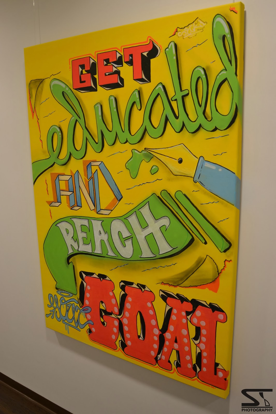
As you may have known, I wanted to cover at least 2 works in the exhibition and I talked about those 2 earlier in a quick 'flyer like' preview I gave you guys; 'Typo Motivation' and 'See Perspectives'. Both of the canvases are made with spraypaint and markers, and they have the same size; 140 x 100 cm. I have used many bright colors, as its a sort of an 'Feelgood - show'! Just look further in life!

Below is the explanation of the separate works, pictures are taken by ST Photography. Feel free to click for a bigger picture!


Canvas 1 - 'Typo Motivation'

This canvas is a qoute that will let you feel good, and also looks nice on the wall. 

I was inspired by those typical lettering styles from the fifties, but every word 'speaks' a different style. There are some 'Vegas Casino' letters, an advertising arrow, letters that are folded and some 3d effects. Its really clear actually, and because it is typography everyone can understand it, so the view and meaning of the work is really obvious.

€ 325,00


Canvas 2 - 'See Perspectives'

The meaning of this work is the exact opposite as the other one; The 'Typo Motivation' piece was understandable in the blink of an eye, this one is totally up to you. I did much sketching work before I got my idea up the canvas, and I reworked the details many times until it was perfect.

The thing that I wanted to show, my idea behind this, is that you have to work hard if you want to get there. Never give up. 'See Perspectives' is invented in a time that I was a bit depressed, I had to draw to get over it.. Put my emotions in it. That's why I am so proud about this one. 

€650,00


The other works that are displayed are not for sale or already sold, like the 'Color Cape' work from 2013. If you are interested in one of the 2 above, you can mail me at seckonegraffiti @ gmail.com, at Park Medisch Centrum I wrote more contact details on the price tags. I gave the secretary ladies a couple of stickers too, just ask for them if you want one!

Take care,

Seck1


Feb 7, 2014

BUSINESS CARDS DESIGN - FOR THE NEW 'SECKDESIGN.COM' DOMAIN!

As you guys maybe already know, I have a new domain, seckdesign.com, that redirects to the blog. Maarten from Pc Fix Duivenbode, the man from the last blogpost, said it would be more professional looking than it was at that time.. And I couldn't disagree. So I bought the domain as soon as I came home, and redirected it to the blogspot account. It was a really smart step, I got even more views and feedback since! Thank you!

But a new domain also asked for a new way of advertising, my goal was to get more of a 'business' page, instead of the street art and graffiti. I got inspired by a blog made by another graphic design artist, Mr Cup. He collects all sorts of inspiring logo's, printing/press techniques and so on in a Tumblr like blog. I saw so many ye olde style typography pieces, that I thought it was a nice idea to do that too - but different!

So I started sketching at home for a business card. When it was done, I digitalized it with Photoshop and Illustrator CS6. That isn't that new for me is it? After that I got to a website called KantoorStempels, a website that sells.. Yes, custom stamp tools! I made my own business cards to give it a real homemade and authentic look, these are the first copies.. I am going to make many more. See the pictures of the production process below.


SeckDesign


'Visit the blog @ SECKDESIGN.COM' & my data on the back


Paper cutting

Really nice! Thanks to KantoorStempels!


Feb 2, 2014

LOGO DESIGN - 'PC FIX DUIVENBODE' & 'NADIA FOTOGRAFIE'!

So my neighbor Maarten asked me to do a 'budget restyle' of his logo. He is the owner of Pc Fix Duivenbode, a company that can help you with any type of pc/mac problems. A total pack of business card, a4 paper and so on wasn't on his mind yet because of the money that it would cost (he has to print it afterwards too offcourse!) so I did a couple of logo variations; One banner work, a square one for business paper and a slightly broader one for invoices and envelopes. It came out well I think, check it out below! 


Maarten a very social guy, so his Pc Fix Duivenbode has many contacts. I met Nadia today at Maartens place, she wanted a logo for her website and business card too. I chose for grey tints because she can add a watermark to her pictures this way.. Business cards are also designed, ordered today. Pictures of the cards will be added later on, but I can show you the logo and quote that I made for her already. Nice!

Take a look at Nadia's portfolio on:

Really nice to get the opportunity to add this to my blog. I would like to thank Maarten en Nadia for this chance, and their kind responses and feedback about my work. Overall, a relaxed day, and I also learned a lot. Dope!

Spread the love,

SECK1

'Nadia Fotografie' logo!


Quote for the businesscard.