Showing posts with label illustration. Show all posts
Jan 1, 2017

Happy new year everybody!

Happy new year everybody! After a time of celebration, today I found the opportunity to sketch something quick with my new Stylefile markers I got as a christmas present. It is a new brand added to my collection, but I'm glad I did. Really nice to have alcohol based markers that do not leave streaks haha.

I also bought one of their displays, not to show off my markers but just to store them. Maybe I'll do a review of these soon.

Seckie


Aug 17, 2016

Streetpins.com Battle Sketch - Magic

I wanted to do another word once again, so I decided to join a battle. After a quick google search I came along StreetPins.com, a really nice sort of social media website on which you could upload sketches, walls and more on your account, available for the other members to see.

They also do a battleword every month or so. To join the word to sketch was 'MAGIC'. Submission can be found here soon. Enjoy!

Seckie


May 14, 2016

Custom Graffiti Canvas Painting for Rocks van de Rots


The beat inspired canvas painting

A really inspiring week it is, once again. Rocks van de Rots, experimental hiphop producer as he calls himself on Instagram (and hell yeah he is!) is following me for quite a long time already. Always positive and with a mind on the future, he told me I was one out of 5 totally different artists to make something to hang around in the studio.

When I got there to 'inspect the wall' and decide what sort of medium was best to hang there, Rocks told me what the inspiration for this work had to be; His new EP, which is coming soon. The artwork is displayed underneath, see for yourself if you feel the vibes I painted! The size is 80 x 60 cm.

Rocks van de Rots' Soundcloud:
https://soundcloud.com/rocksvanderots


Inspire, and get inspired!

Seckie


Feb 18, 2016

SCREENPRINTING @ MPC - SPRAY CAN

Quick update, I've been to a screen-print workshop today. Big thanks to the Mesh Print Club and the Grafisch Lyceum Rotterdam, who gave me this awesome opportunity. Decided to upload this, because it is something different than I normally do:

First off, I sketched the spray can and cut it out to make the stencil out of it. After that we printed it on a cotton bag, by placing the stencil underneath the screen. At home further details were added with Uni Posca / Molotow paintmarkers.

The Finished Product - 'Express Yourself' 2016

The fresh Screen print


Oct 13, 2015

Weekly Comics for Music Production Academy

News from the internship front! This week, Michael challenges me to create something different without other members of MPA interrupting. Nah it isn't interrupting, but you know what I mean. Most of us Graphic Designers and Illustrators want one thing: that is total freedom to create the most perfect whatevers, possible. 

Together with the marketing member Rick, we came up with a totally new thing in the Music Industry; At the MPA Facebook page, we introduce the weekly Comic Column! Cheesy comics about the music industry, EDM, ADE, and the most known deejays and their current carreer changes.

Every week MPA drops a new comic drawing by me. I will update the post every week on Tuesday, so be here around 6 o'clock!

Seck Design


Searching for the Hi Hats - MPA Comic - 2015


Avicii taking it to another level.. - MPA Comic - 2015

Aug 7, 2015

Customized Stunt Scooter - Jagar Graffiti

After a custom painted pair o' Vans, a cap and an Eastpak it is time to move on to something other than clothing.. A skate & stunt scooter my brother owned was yeah, pretty much reserved for a repaint. 

A new object comes with a new challenge, that is why I've decided to sand it before painting. This way I wanted to erase everything that was silicone or other paint killing based. After that we painted the base coat, which was done with MTN 94, and some pink dot caps.

After the 2 hours drying time, which was really necessary I knew due some mistakes I've made in the past, I put on some white lines to create the base outline of the letters. I was aiming for a 'hulk comic' style lettering, and if Marvel would add 1 element in every comic they make; It is something cracked up. With green I cracked up the whole bit. I also love the typical explosion clouds in comic books, so I gave a little twist to my purple bubbles. The end result is the picture below, & I will update this post as soon the video is done. Yo!

Seckie


Custom Scooter - 'JAGAR' - 2015

Jul 1, 2015

GRAFFITI BLACKBOOK - COMIC COMPOSITION

While its nighttime already, and I'm trying to catch some sleep, I couldn't resist a quick update. Been working on some new styles lately, and focusing on colour use, and total composition. This one is a bit inspired on the Back to the Future - eighties title screen. As I tried to get my lines as straight as possible, I realised that it isn't as easy as it looks.. Practice makes perfect. Bringing this to the wall soon; Definitely!

Seck1


Comic book style practice - 2015

Jun 17, 2015

ILLUSTRATION - STEP BY STEP - ROSE PRACTICE!

Today I felt like practicing my shadows again. Drawing roses was the thing to do. I has been a long time, so there was a real need for that. I've made photos throughout the process, just as a note to myself; Nothing wrong with documenting some of my practice work as inspiration later on. Practice is to make things better, so I hope I'll be able to pull off more detailed shading in the future. That is what this practice is all about, but I have a real love for the tattoo style of drawing plants and flowers - because of the harsh/opaque outline work just like in graffiti.


This step by step post isn't how I did them back in the day. Inspired by another artistic blog, I'm trying to explain all my choices I've made below every photo. I've used a photo reference for detailing, but my drawing style is still to cartoonish for this type of drawing. I'm unable to reproduce it as realistic as I want, but yeah, 'practice makes perfect'.


As in almost every drawing, I start off with a sketch. I didn't want to upload the reference photo because the end result really doesn't look like the real deal, but there is only one advantage of sketching; It's the perfect way to get the basic lines of your idea on the paper. Just to be clear about the lines, I did put these in the spots where the shadow was the darkest of all.


At this point, I had to watch more closely for the basic shadowing; This part was done with pencils, and for the real deep tints I've used a red marker later on. To add quick shadows is important for me to sort of 'unlock the 3d features' in my project.


A more close up look at the coloring details. If you look closely you will notice that I tried to get a nice shade done with the marker, but because I only wanted to use 1 marker tint, after filling one leaf I realized this wasn't going to work how I wanted, so to keep it clean I decided to color the surfaces plain, the oldschool way. We'll do better next time, Seckie.


While coloring the cane I saw which direction this was going to.. Rather shiny, than realistic. But that doesn't matter, because thats the way I use to work. I can't blame myself for trying something different and just fall back in old fashioned ways of drawing, without any practice. Second thing is, I started drawing when it came to my head just a couple of hours ago, so I'm sorta content with what's happening on the paper now; Without any preparation this is all-right.


To finish this experiment, I wanted to see what opaque outlining does to such a soft and lovely object like a rose. I ran a fineliner over almost every line, and gave a quick pencil fade to get rid of the white in the background. When executing the right shadow we could achieve extra 3d, but that wasn't the main subject here. After a little white highlight we were done.

What I think, is that it is important to be able to reproduce the right shadows in the projects that need that little extra-dynamic feel. Though my work is opaque and filled with lines, proper shading could make things better - for real. Today, we gained one step to the destination; Proper Shading.

See you guys next time.

Seck1


Apr 25, 2015

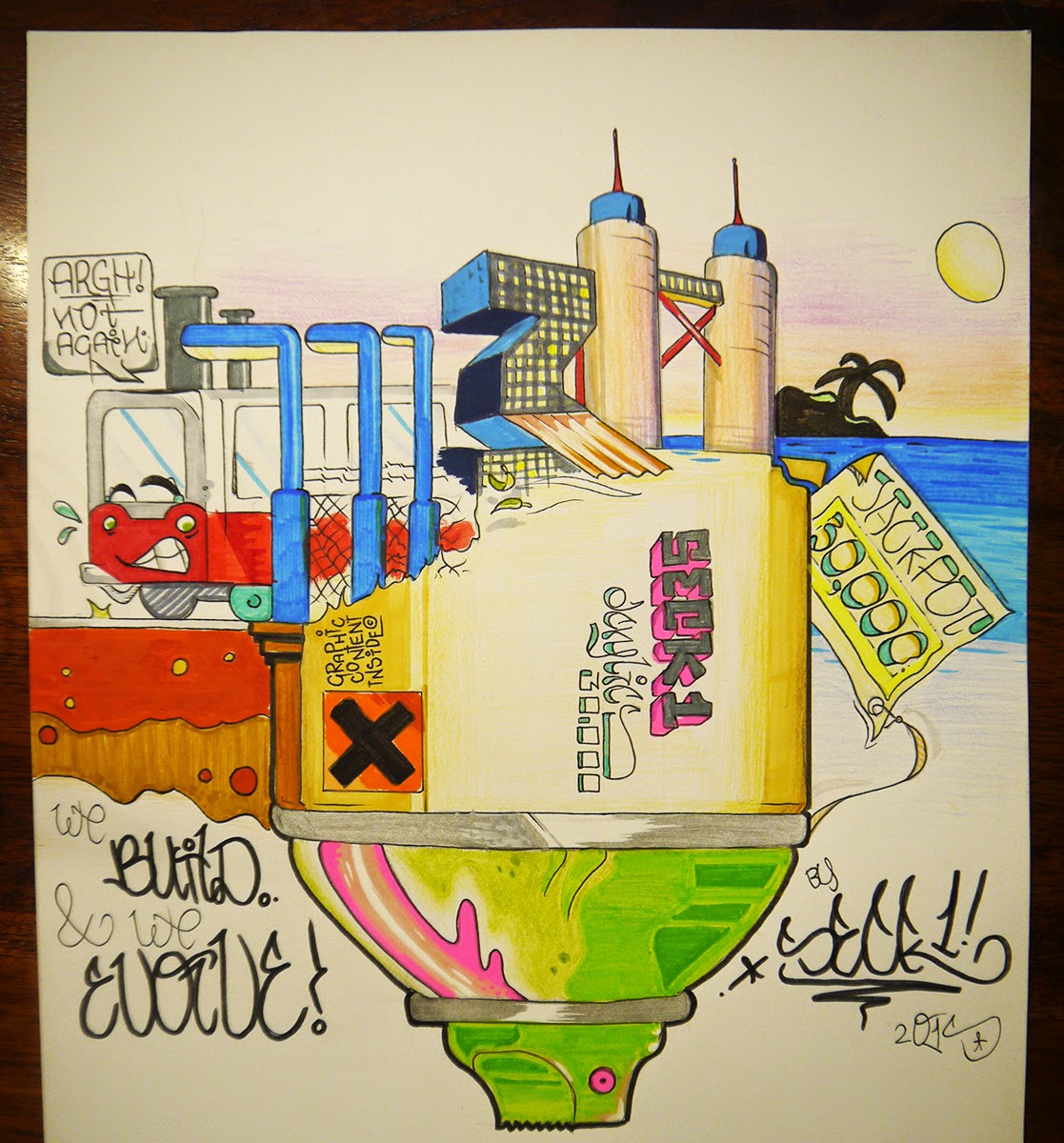
ILLUSTRATION - WE BUILD & WE EVOLVE!

What is up folks! New post was delayed for almost a week, because on my internship there's so much to do, there is no room for illustrating left. This illustration idea came up last week, when this website reached the 30 000 pageviews mark. And that even before making the website SEO proof! I thought; 'This whole thing consisting a growing amount of readers, the progress that I make, the new drawing tools that I discover.. It all started with a can of spraypaint.' I started to work on this idea by sketching an upside down spraycan, and a cityscape above; a mix between subway graffiti related stuff, and the expensive things in life. 

There are a couple of thirties' mixed in, with a reason off course. I want to thank all guys that I collaborate with first, my mate Tober, Soak from Amsterdam, Fines, the USD members, and all sticker traders who decide to put my stickers into their packages when sending out.

Then there are the readers of the Seck Design blog; The people who write comments with love, the people who give constructive (and non constructive) criticism. Thank you guys for putting a smile on my face, or inspiring me to make my work more professional. 30.000, not bad for a student is it? Love!

To the next 30.000, and beyond!

Seckie, from Seck Design


WE BUILD AND WE EVOLVE - 30.000 PAGEVIEWS TRIBUTE!

Nov 5, 2014

FREE PDF DOWNLOAD - NS MATERIEEL '64!

Once upon a time, I was searching the web, as usual, for new blogs to follow. I stumbled upon a really awesome piece on a train, as usual. Everything went like it always did. The big difference was that this train was a template in a blackbook, in black and white, with all room for sketching. Really dope idea, but it bothered me that the shape was really common, or it were the typical NYC subway trains.

Since that day I always kept an eye out for the typical Dutch NS 'hondenkop' trains, but I couldn't discover the printable version.. So I made one myself! This is an illustrator project I've been working on for the past couple of days. I am trying to make a RET subway train and an ARRIVA bus template soon, so keep an eye out for the full package! 

This one is a free download! It comes out best on an a3 format print. Check out the preview below, and download the PDF file here:
Enjoy!

Seck1

QUICK TEST SKETCH!
BLACKBOOK TRAIN TEMPLATE 1 - NS MAT '64 (JPEG)


May 3, 2014

ILLUSTRATION - 'IS THE SKY REALLY THE END?'

A couple of days ago I reached 10 000 page views, a milestone. I want to thank everybody that read my blog, saw my work, gave me feedback, even the people that complained; Thank you all, the mistakes are only to learn from. This blog is something I'm proud of, the compliments and extra pageviews made my day; Especially the ones from DutchDamage. Special thanks to user 'Boy Zonderman' for posting my link in the blog section! Keep it up!

I've made a illustration about these days; My girl is starting to paint also, she even got a blackbook and markers.. We already painted her first piece, and the sun is shining. It is getting warmer and warmer. Everybody's happy. Those things make me think about my future in a bright way; Can't I get up higher? Can't the blog get bigger than it already is now? Offcourse! Let's do that! I'll keep sketching anyway but this is like piece that tops it all.

This time we've got a flying backpacker. He has a painting-mask on, and he's leaving red drips everywhere. The guy that is confident about every step he makes, but also does whatever he wants to do. 'Is the sky really the end?' This one is made with ink and paintmarkers, and finished off with fineliners, grey shadowing and some highlights. Enjoy this proud graffiti writer illustration!

Much love, 
Seck1


Apr 14, 2014

BRIGHT LETTERING SKETCH - 'GOODLIFE'

Sometimes sketching is in a lower state.. On the one hand its a pity that I forgot to update the blog every time  and I didn't pull off new sketches. But on the other hand; My hard work is paying off. Not only my artwork is being appreciated more and more and the blog that did hit 9500 pageviews made me happy, but I also found a girl that takes me how I am, and love can brighten up your life so much.. This is all a dream coming true for me.

Today I felt like sketching again. After doing a really personal mural with Jamie in my bedroom, I was left thinking what would be next. I am in an illustrating mode lately and I really want to discover how to get real crisp shading done, but lettering and graffiti are my roots that are always lurking in the dark. It is still so much fun to get a quick piece done without having to think about anything.. Unfortunately Bob Ross was one of the few that really understood the peace and calmness that comes with art; Just keep adding things in silence until your piece of work is just perfect.

This 'goodlife' lettering is just the way I wanted it. Nothing more nothing less. I believe that everyone with a bit of inspiration can make a piece of art, the 'scared to fail' part is all in between your ears.

Enjoy this bright update!

Seck1

SECK1 x 'GOODLIFE' x 2014

Mar 2, 2014

DRAWING PORTRAITS 4 FACEBOOK #2 - MANYA

Ha, about 2 days ago I was in an portrait drawing mode again.. An good idea came up in my mind: Why not drawing facebook friends? I posted an update that was something like 'Suggestions on drawing a portrait tonight? You could ask if I like to draw you but don't complain when your face is on my blog a couple of days later hahaha.' The amount of comments were.. huge. More than 8 people already.. Damn. Thats a lot of work to do! I think i'll make a series of this, every day that I have some spare time, I will draw one of you guys that are interested and tag you on facebook. Stay tuned if you commented!

I will only draw you if I know you in real life, and don't expect too much; I am still learning!

I have done the second drawing today.. Worked out better than the first one, but a composition of two faces was something I had never done before.. Drawing girls is much more interesting off course haha. Started out with the sketching part as always, and this time without the struggle of getting the nose in the right place. It motivates me when that happens, so I decided to also finish it right off.. Shadows did came out well, and her hair did the job.. Just as in real life. It is an honour to draw someone with such beautiful hair haha.

Btw, I will get another stamp ink color, black fits a whole lot better with these drawings. Green isn't the right thing here..

More soon!

Seck1


Mar 1, 2014

DRAWING PORTRAITS 4 FACEBOOK #1 - DANNY

Ha, yesterday evening I was in an portrait drawing mode again.. An good idea came up in my mind: Why not drawing facebook friends? I posted an update that was something like 'Suggestions on drawing a portrait tonight? You could ask if I like to draw you but don't complain when your face is on my blog a couple of days later hahaha.' The amount of comments were.. huge. More than 8 people already.. Damn. Thats a lot of work to do! I think i'll make a series of this, every day that I have some spare time, I will draw one of you guys that are interested and tag you on facebook. Stay tuned if you commented!

I will only draw you if I know you in real life, and don't expect too much; I am still learning!

I started yesterday with the first message, first come first served you know. Danny didn't have that many high-quality pictures on his page, so I just picked one and made my own composition. I saw a picture of him with his son, Damian. I know them from a soccer club that's for kids with autism, and the trainers (Danny is one of them) are all doing it to help another human. Really nice! Autistenvoetbal also has a page on facebook, they are even playing against other clubs now. Keep it up guys.

Thanks for letting me portrait you! It's an honour!

Seck1


Feb 20, 2014

CUSTOM VANS ERA'S, US SIZE 9,5 - BREAK OUT!

Yes! Spring is coming again. That means that the sun is going to take a look again, and the shorter shorts could be taken out of the closet. Really lovely time of the year! I did a pair of Vans shoes before, those were the Atwoods as I remember? I plan to do a pair every year, so I could walk out with a fresh pair of Vans every summer. 


Progress!
Those 'Atwoods' were so filthy, they weren't what I expected in any way. The idea I got when started painting the shoes was fainted when I was finished.. Meh. They are not bad, nowadays they are still wearable - with the paint on after a rough 20 rainstorms. Good for piecing at a legal wall from now on, but not for the more serious things..

Cleaning your closets always give you surprises. I don't have the budget right now for new fancy boots, so I was really enlightened when I found these Vans Era's. I really wanted to do a pair with a 'canyon edge' like surface, like it was about to break off. So I made a comic book / Marvel style edge break-off with a lil' Seck change. Enjoy!

Seck Design


SECK x VANS ERA x SPRING 2014

Feb 17, 2014

Art Exhibition at Park Medisch Centrum

Today we went to the medical centre to put up my paintings at Park Medisch Centrum Rotterdam. I already got permission, but with all the commotion around it I was a bit nervous when we arrived. Thanks Paul from Ropana for marketing me and my work at Park Medisch Centrum, and Muis for taking care of the canvases while driving to the location. Really nice opportunity to gain more success! The few people I saw were positive in an instant, that's a good sign! Work hard, and you will get there is what they told me, and its paying off!

My paintings are available to the public at:

Park Medisch Centrum
Hoofdweg 90
3067 GH ROTTERDAM

The Netherlands

http://www.parkmedischcentrum.nl


As you may have known, I wanted to cover at least 2 works in the exhibition and I talked about those 2 earlier in a quick 'flyer like' preview I gave you guys; 'Typo Motivation' and 'See Perspectives'. Both of the canvases are made with spraypaint and markers, and they have the same size; 140 x 100 cm. I have used many bright colors, as its a sort of an 'Feelgood - show'! Just look further in life!

Below is the explanation of the separate works, pictures are taken by ST Photography. Feel free to click for a bigger picture!


Canvas 1 - 'Typo Motivation'

This canvas is a qoute that will let you feel good, and also looks nice on the wall. 

I was inspired by those typical lettering styles from the fifties, but every word 'speaks' a different style. There are some 'Vegas Casino' letters, an advertising arrow, letters that are folded and some 3d effects. Its really clear actually, and because it is typography everyone can understand it, so the view and meaning of the work is really obvious.

€ 325,00


Canvas 2 - 'See Perspectives'

The meaning of this work is the exact opposite as the other one; The 'Typo Motivation' piece was understandable in the blink of an eye, this one is totally up to you. I did much sketching work before I got my idea up the canvas, and I reworked the details many times until it was perfect.

The thing that I wanted to show, my idea behind this, is that you have to work hard if you want to get there. Never give up. 'See Perspectives' is invented in a time that I was a bit depressed, I had to draw to get over it.. Put my emotions in it. That's why I am so proud about this one. 

€650,00


The other works that are displayed are not for sale or already sold, like the 'Color Cape' work from 2013. If you are interested in one of the 2 above, you can mail me at seckonegraffiti @ gmail.com, at Park Medisch Centrum I wrote more contact details on the price tags. I gave the secretary ladies a couple of stickers too, just ask for them if you want one!

Take care,

Seck1


Feb 7, 2014

BUSINESS CARDS DESIGN - FOR THE NEW 'SECKDESIGN.COM' DOMAIN!

As you guys maybe already know, I have a new domain, seckdesign.com, that redirects to the blog. Maarten from Pc Fix Duivenbode, the man from the last blogpost, said it would be more professional looking than it was at that time.. And I couldn't disagree. So I bought the domain as soon as I came home, and redirected it to the blogspot account. It was a really smart step, I got even more views and feedback since! Thank you!

But a new domain also asked for a new way of advertising, my goal was to get more of a 'business' page, instead of the street art and graffiti. I got inspired by a blog made by another graphic design artist, Mr Cup. He collects all sorts of inspiring logo's, printing/press techniques and so on in a Tumblr like blog. I saw so many ye olde style typography pieces, that I thought it was a nice idea to do that too - but different!

So I started sketching at home for a business card. When it was done, I digitalized it with Photoshop and Illustrator CS6. That isn't that new for me is it? After that I got to a website called KantoorStempels, a website that sells.. Yes, custom stamp tools! I made my own business cards to give it a real homemade and authentic look, these are the first copies.. I am going to make many more. See the pictures of the production process below.


SeckDesign


'Visit the blog @ SECKDESIGN.COM' & my data on the back


Paper cutting

Really nice! Thanks to KantoorStempels!


Jan 22, 2014

SNEAK PREVIEW - EXHIBITION 'LOOK FURTHER'

After almost 1,5 months working on two 140 x 100 cm canvases, we're pretty much there. My feelgood - exhibition is going to be a great learning experience, and it's a great honour to take (the biggest) part in this business! The preparations are taking place, I got permission.. Its going well!

My inspiration came from a couple of people that were in a bad / depressed position, with their work / school, or with the family situation at home. As I wasn't in a good position with the problems and surgery on my eyes soon, I had to convince myself that it all was going to be allright. I started drawing and sketching, playing around a bit, and I came to a new idea;  Why wouldn't I show the rest of the world around me why you have to think positive - in a creative way? Thats why I made these pieces, and I want to share them with you; Soon!

Here are two close up previews from the work I've done, in a flyer like advertisement method. More pictures soon when my canvases arrived at the location. Enjoy, and stay tuned to the blog people! 

Don't forget to enjoy life! Take care,

SECK1


Jan 8, 2014

ILLUSTRATION - 'STRATIOTIS DUBSTEP'

Yeah bro, good way to start off my blogging-2014! My man Jedidiah aka Stratiotis Dubstep asked me I wanted to join him at a party at the Hague, at Paard van Troje because he had to drop a set.. It was called HAAGEN BASZ. He was mixing skanky tunes for a long time already, so it was an sick set b2b Skitzo Dubz! I got a couple of the most dope moments in a video, check it out here.

When I returned back home, I got to his Soundcloud channel to get a better look at it, since I only played a couple of mixes.. His name Stratiotis is an true eyecatcher, so I wanted to know what it means.. According to Wikipedia:

'The Greek term stratiotis/-ai (στρατιώτης/-αι) was in use since classical antiquity with the sense of "soldier" (e.g. Herodotus 4,134, Xenophon, Cyrus An. 7, ch. 1, 4 etc.) The same word was used continuously in the Roman and Byzantine period.'

As I know he served in the military I know why he had chosen this name. It got me inspired instantly and I wanted to make another illustration like the previous one.. So I made a 'Stratiotis DUBSTEP' lettering with the sorta same style as the last one, with an dutch soldier helmet above, but it has a special touch.. U gotta like dat bass helmet yo! Woiii!

SOUNDCLOUD!


'STRATIOTUS DUBSTEP'

Dec 26, 2013

ILLUSTRATION - 'BEWARE OF THE OCTOPUS'

I think this is the last one for 2013.. Thank you for all the views, feedback, commentary and promoting. It was a big year for me and I couldn't do this better without all your support! I hope you all will face a beautiful 2014, keep working hard!

Yesterday I started with an monster octopus; I want to dive in tattoo sketching really bad so thats a good one for 2014! It came out more pink as I wanted but I focussed on the lettering, the big guy eating a ship was an side issue. Overall it came out well! Might digitalize this one 1 day, illustrator works for a shirt or something! 

This is an good ol' 3-steps-exposed type of blog; one sketch-pic, one colouring-pic and the end result as another photograph (outlines and finetuning).

Enjoy, have a nice holiday!

SECK1


'BEWARE OF THE OCTOPUS'

Coloring, pinkish!

Sketching part